
UBER
Uber is everyone’s private driver who is environmental, friendly, comprehensive, and reliable worldwide.
UBER
Rebranding Project
Dec, 2017
ArtCenter College of design
Special Thanks to Sean Adams,
and Gerardo Herrera
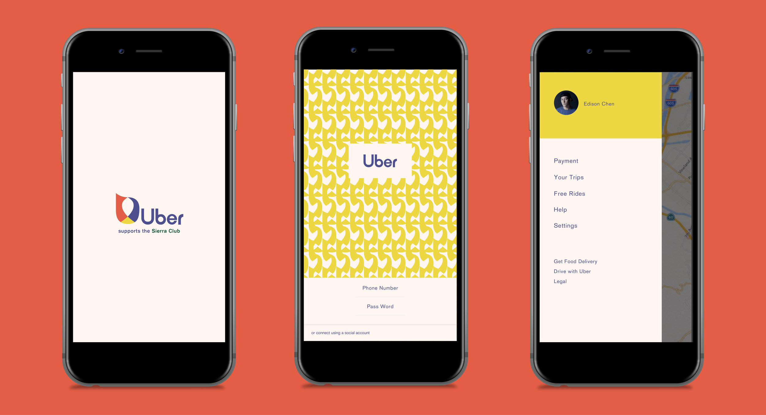
Uber | the SIERRA CLUB
Uber supports the Sierra Club
What can we do to elevate Uber brand image?
Although Uber has a very successful business right now, a variety of negative cases happened in its senior management and drivers that really influenced the reputation of this company. Also, Uber has struggled with lots of issues regarding sexual harassment. After that, Uber has competitors form the U.S. and worldwide. Uber is not only efficient transport problem-solver anymore. A variety of companies try to imitate Uber.
Brand Issues
Uber’s logo visually looks too technical, unfriendly, and serious. The shape of icon looks like a coin.
Brand Concept
Uber should tell more about its value, responsibility, or philosophy to audiences. It should let people know that Uber does not only want to make money, offer convenience, and reasonable price but also they contribute to the world. Uber has a valuable quality but it does not promote wellness, such as environmental protection and energy saving. When people use Uber, they do not need to drive their own vehicles. UberPool and Uber SUV will give more rides to people. If Uber adds this attribute to their company, people will feel happy to take Uber since they are saving energy and protecting the environment. Uber could use this way to represent they are friendly and reliable. Finally, I added Sustainable, friendly, reliable, and competitive into Uber re-brand. In order to release its new brand, Uber will hold a brand launch event with the SIERRA CLUB.
Identity System
Inspiration & Logo Study
Base on the attributes, tree roots is the core idea that inspired the new visual identity.


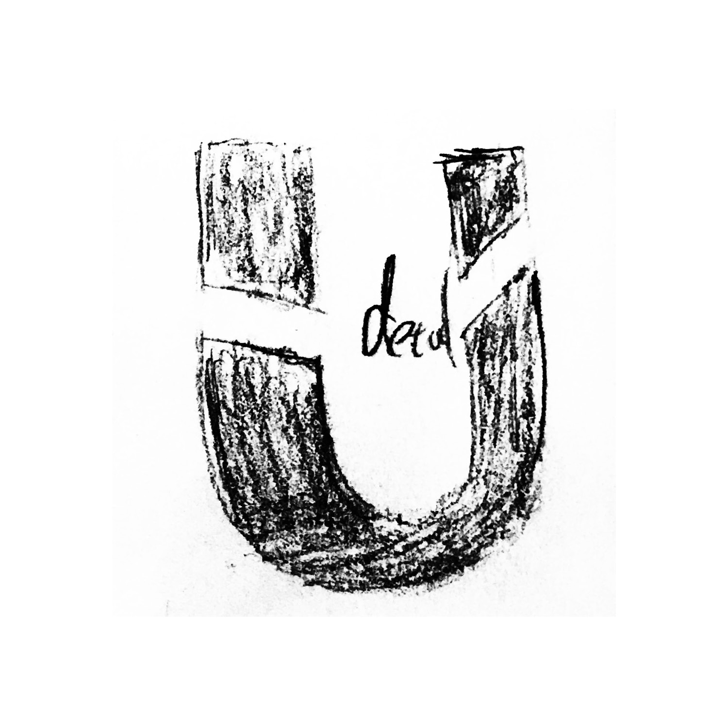


Logo Mark
There are three elements in the logo: rider, driver, and Uber System. The rider and driver components are connected by Uber system.
The entire form of the logo is based on the letter “U”.

Word Mark

Lockup

Icon System

Typography

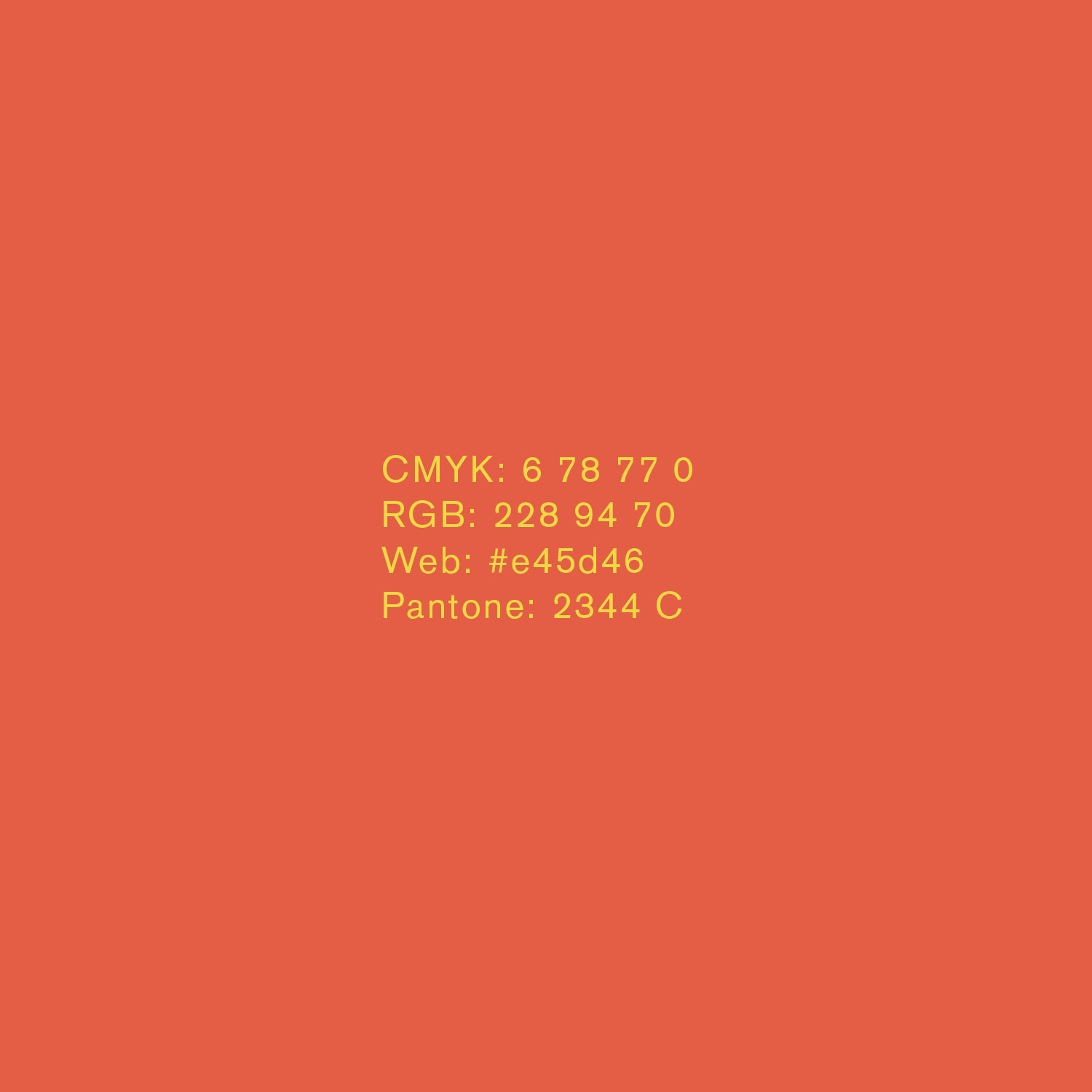
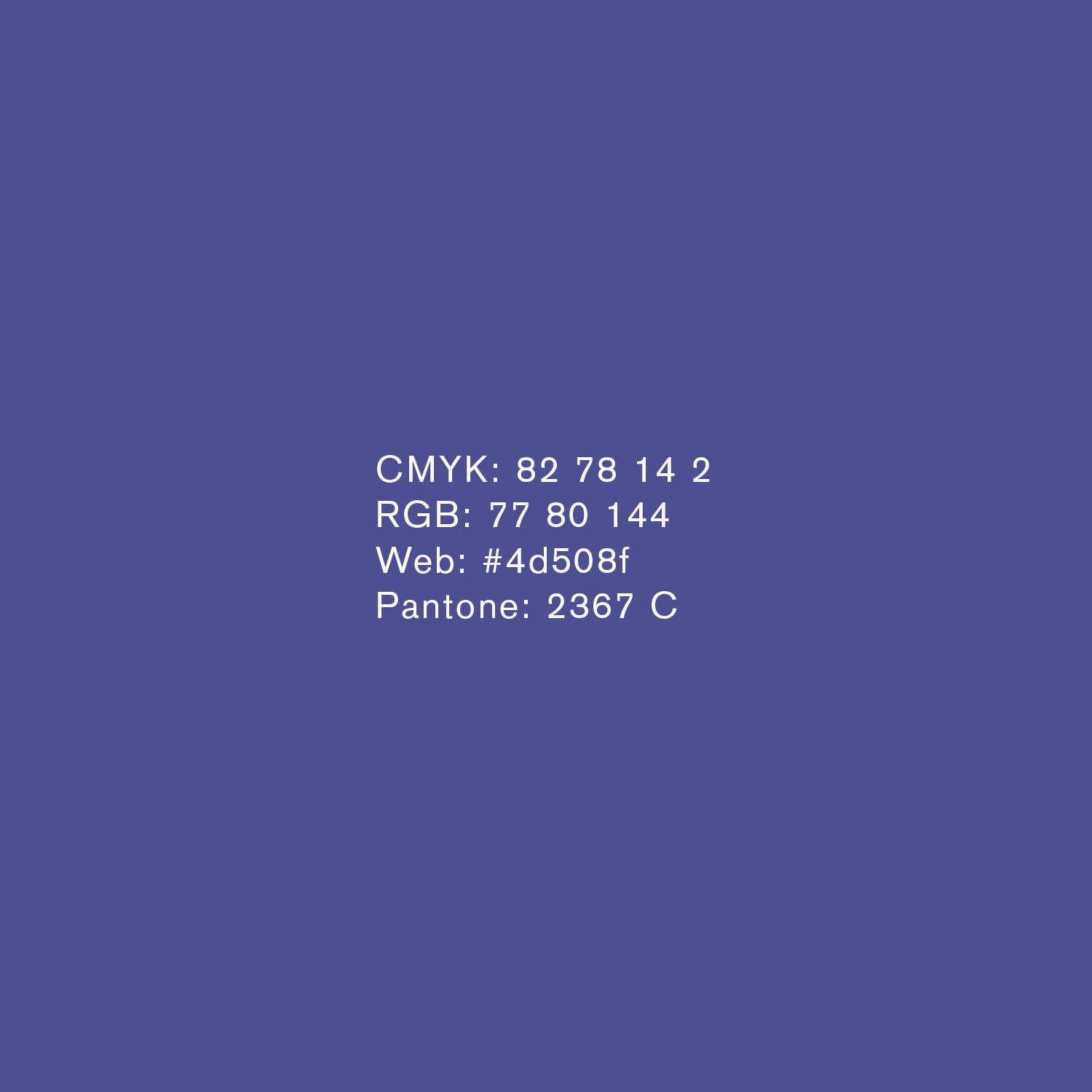
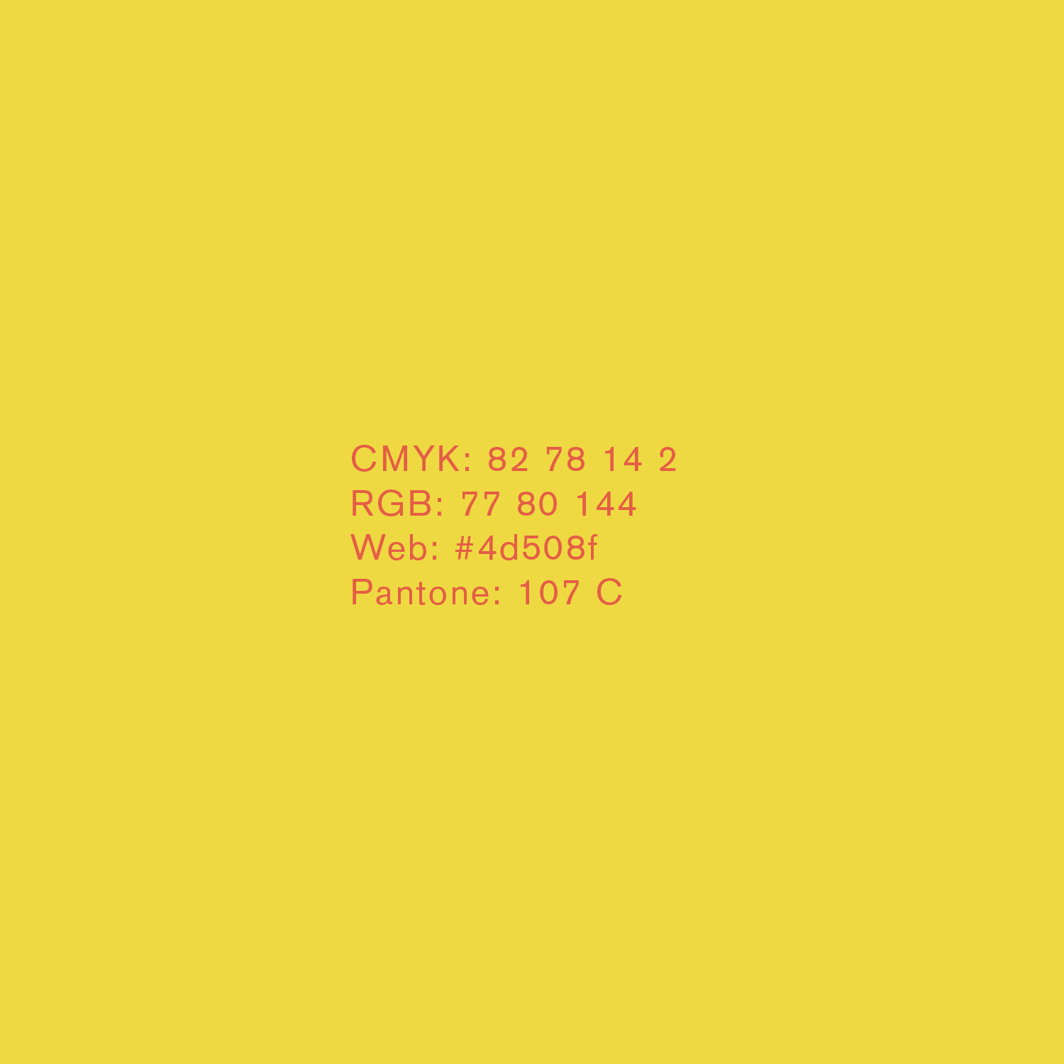
Color Palette
Brand Pattern

Brand Stationery


Promotional Posters


Mobile and Web Application


Applications


Promotional Video
Brand Bible


