
Rethink & Reimagine_LBPD
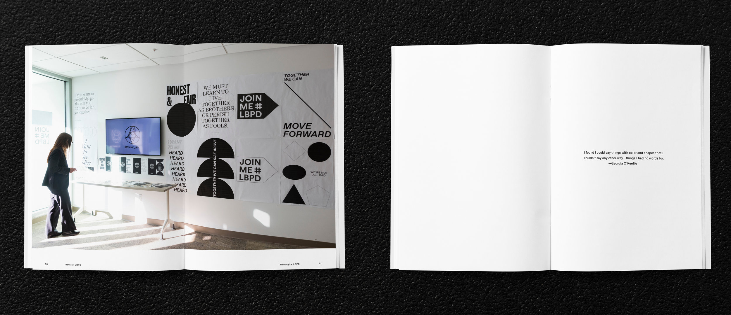
I found I could say things with color and shapes that I couldn’t say any other way—things I had no words for.
—Georgia O’Keeffe
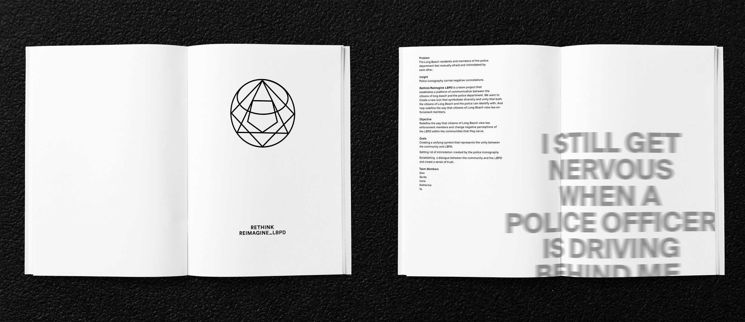
RETHINK/REIMAGINE_LBPD
Visual Communication Project
For the City of Long Beach
Dec, 2018
ArtCenter College of design
Designmatters’ Department
Team Member:
Alexandra Lebrun
Serda Ursan
Irene Wiryanto
Katherine Choi
Ye Tian
Special Thanks to Tyrone Drake,
JD Buckley, and Jennifer May
Rethink/Reimagine LBPD is a team project that establishes a platform of communication between the citizens of long beach and the police department. We want to Create a new icon that symbolizes diversity and unity that both the citizens of Long Beach and the police can identify with. And help redefine the way that citizens of Long Beach view law enforcement members.
Problem
The Long Beach residents and members of the police department feel mutually afraid and intimidated
by each other.
Insight
Police iconography carries negative connotations.
Objective
Redefine the way that citizens of Long Beach view law enforcement members and change negative perceptions of
the LBPD within the communities that they serve.
Goals
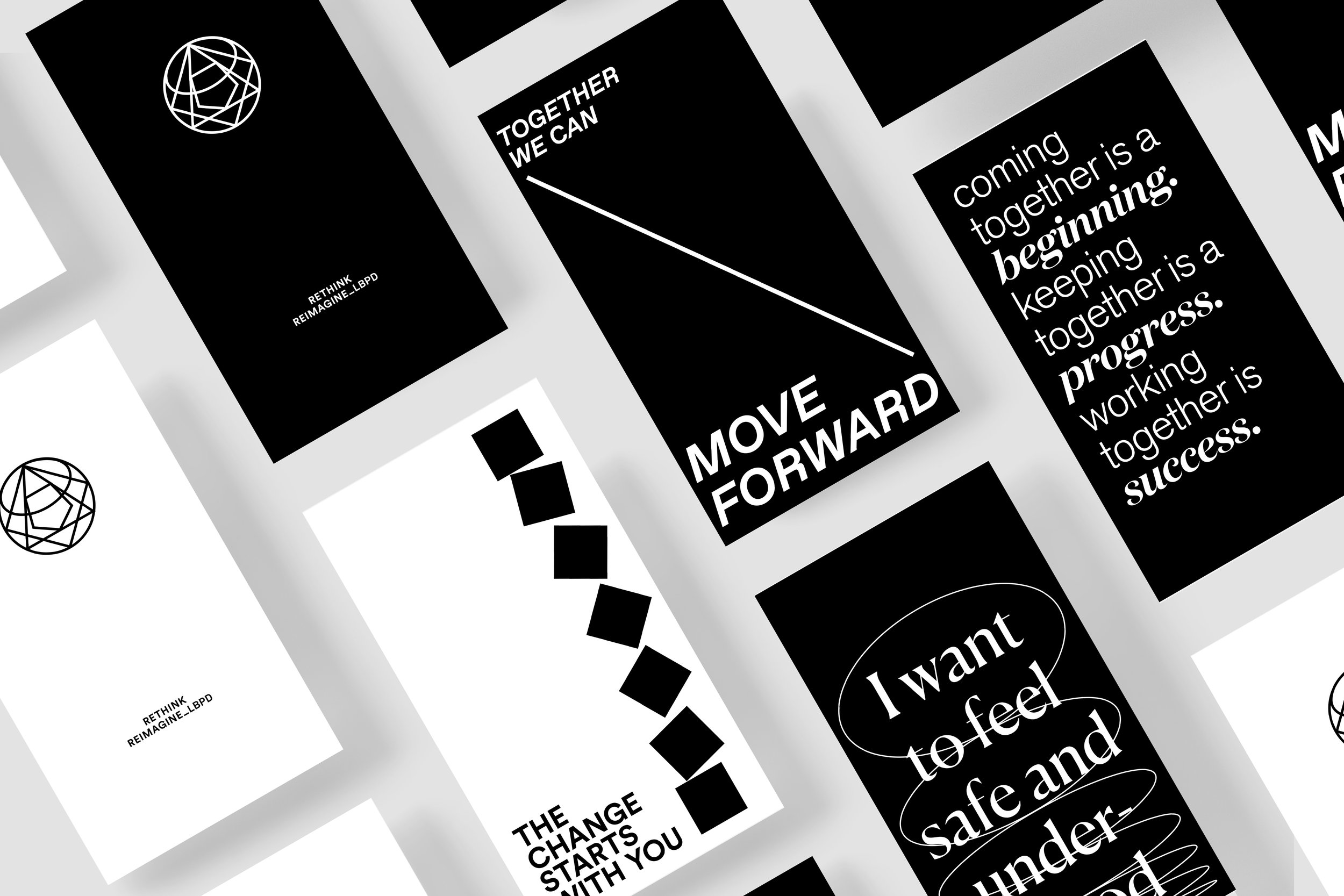
Creating a unifying symbol that represents the unity between the community and LBPD.
Getting rid of intimidation created by the police iconography.
Establishing a dialogue between the community and the LBPD and create a sense of trust.
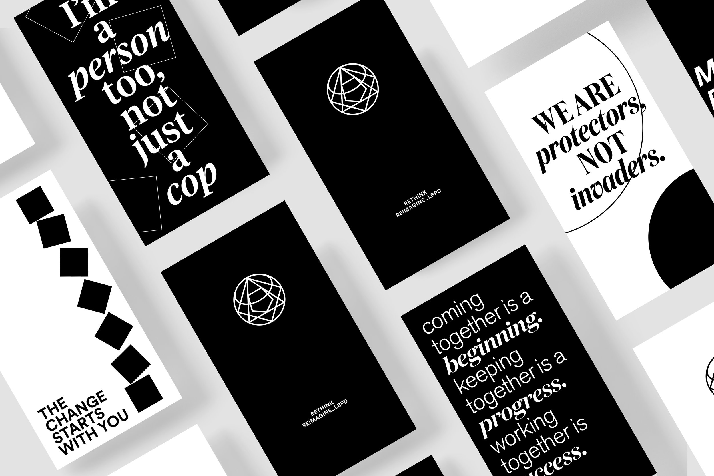
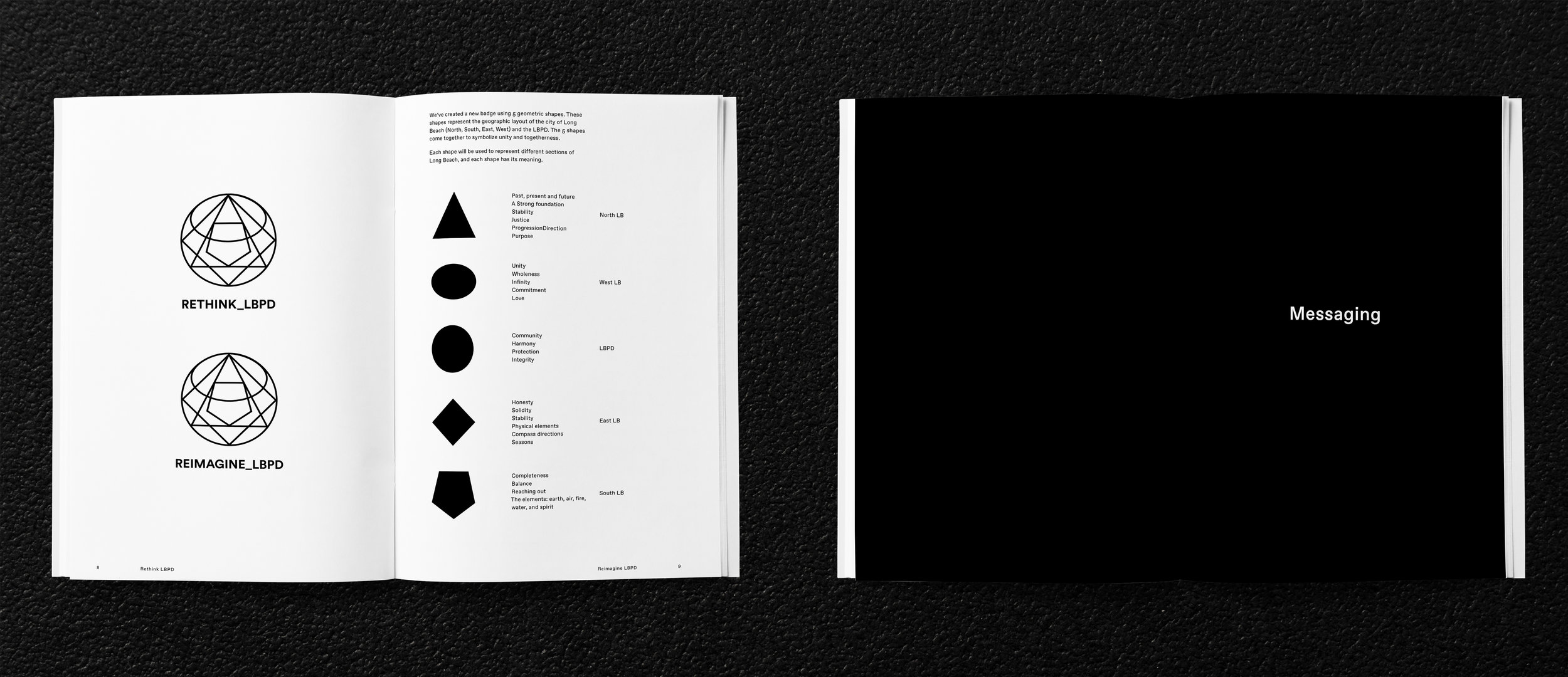
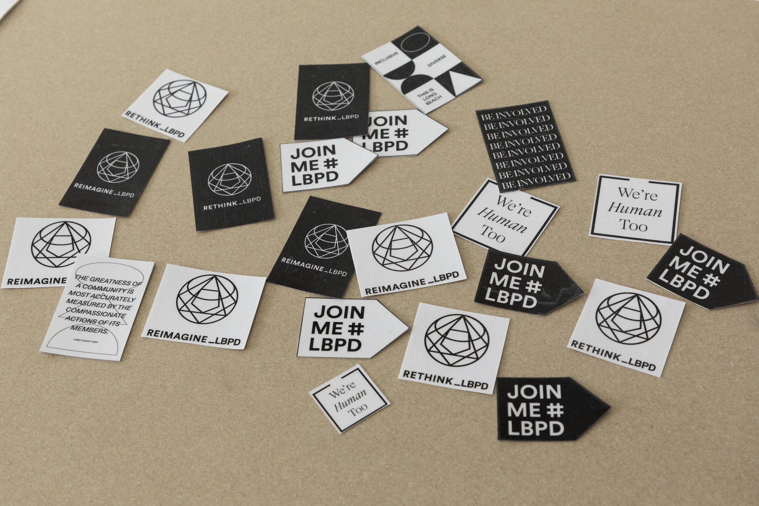
The Badge
We’ve created a new badge using 5 geometric shapes. These shapes represent the geographic layout of the city of Long Beach (North, South, East, West) and the LBPD. The 5 shapes come together to symbolize unity and togetherness.
Each shape will be used to represent different sections of Long Beach, and each shape has its meaning.
The Badge Motion

The badge Pattern

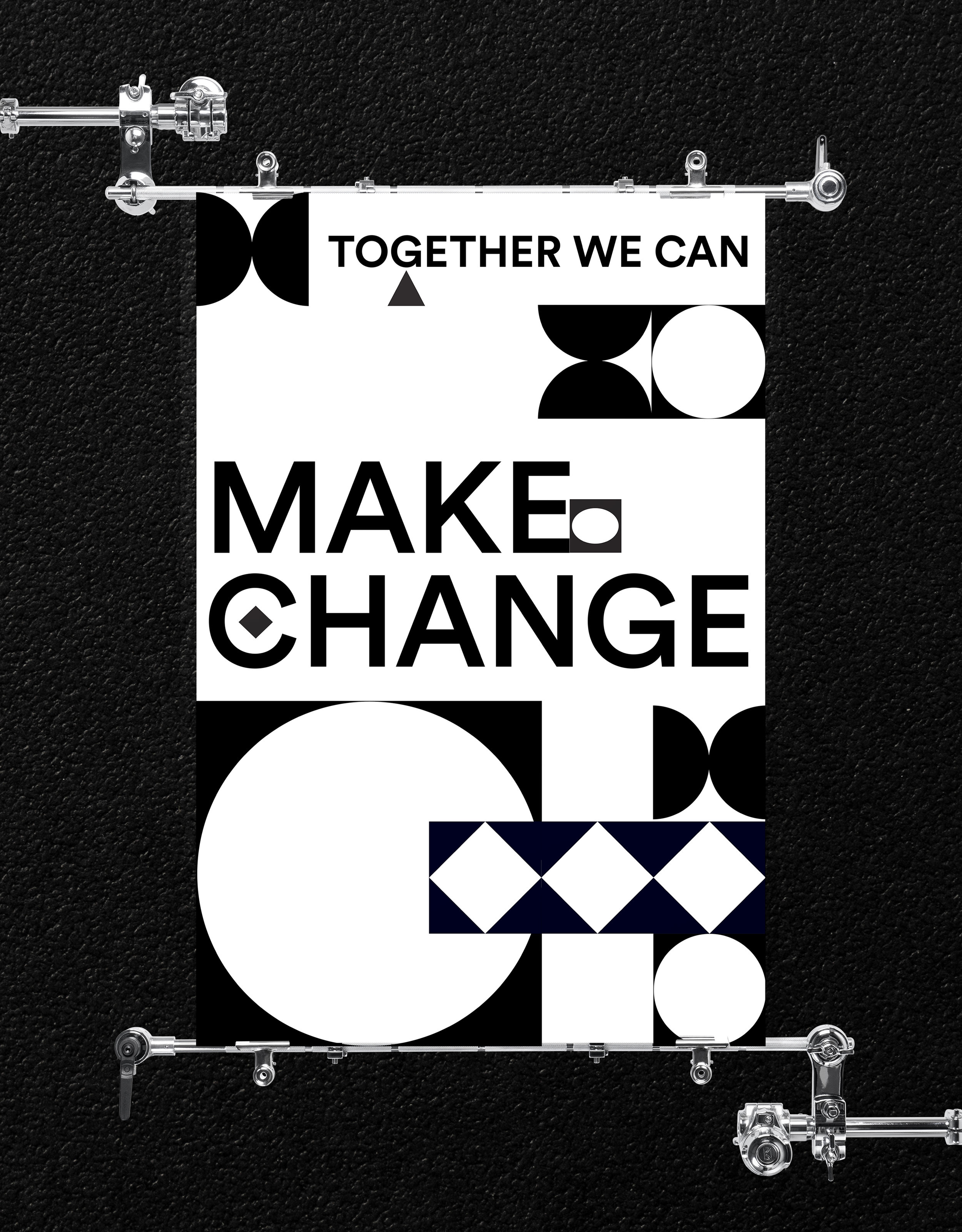
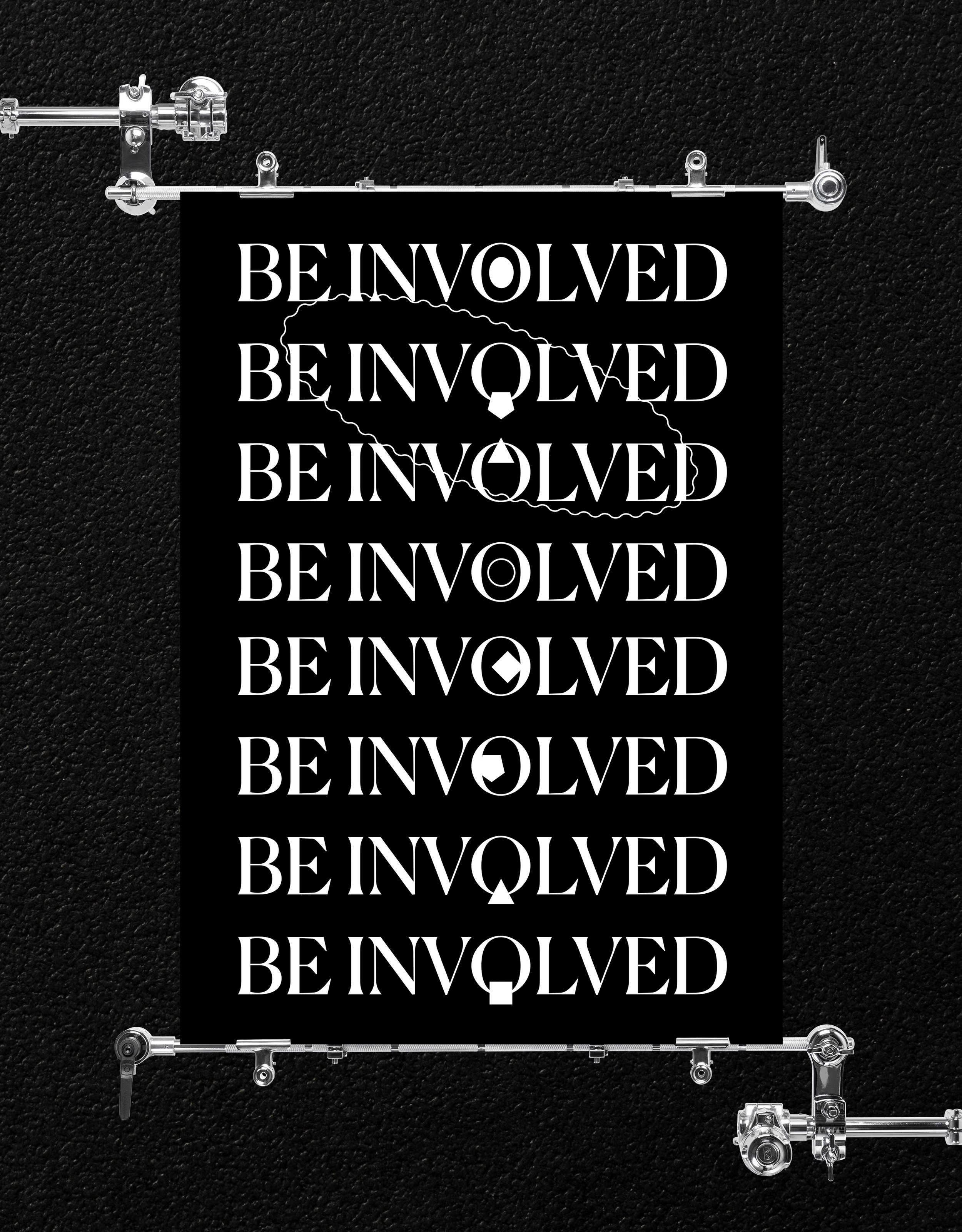
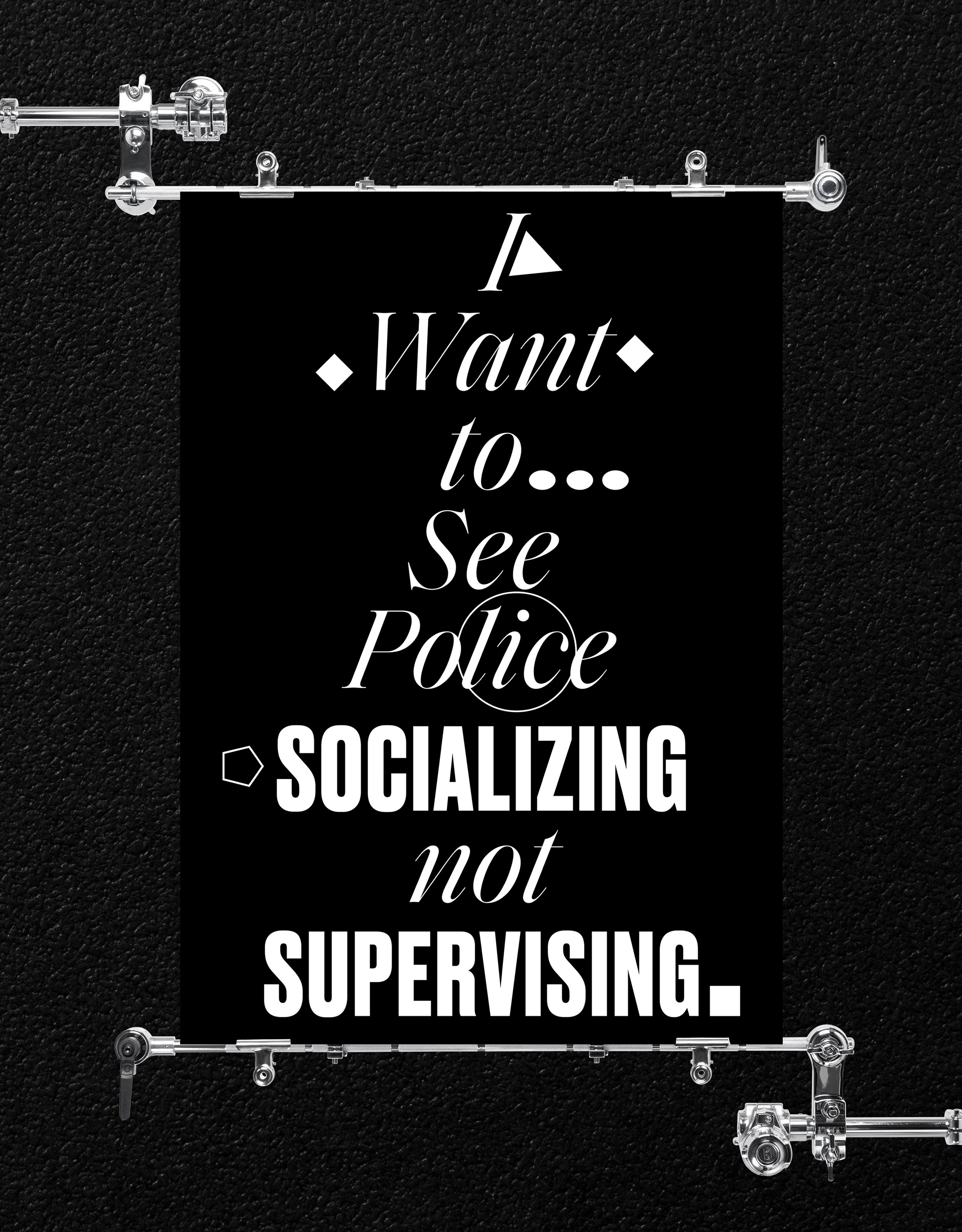
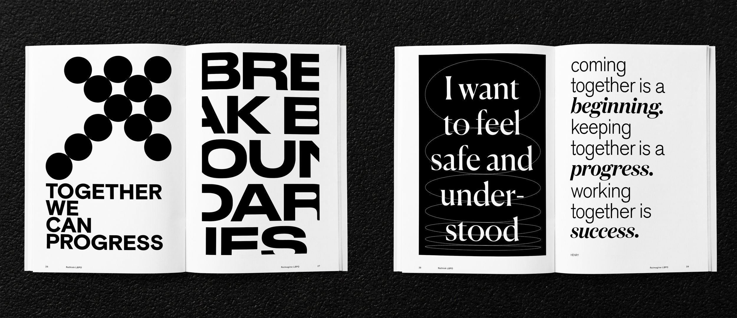
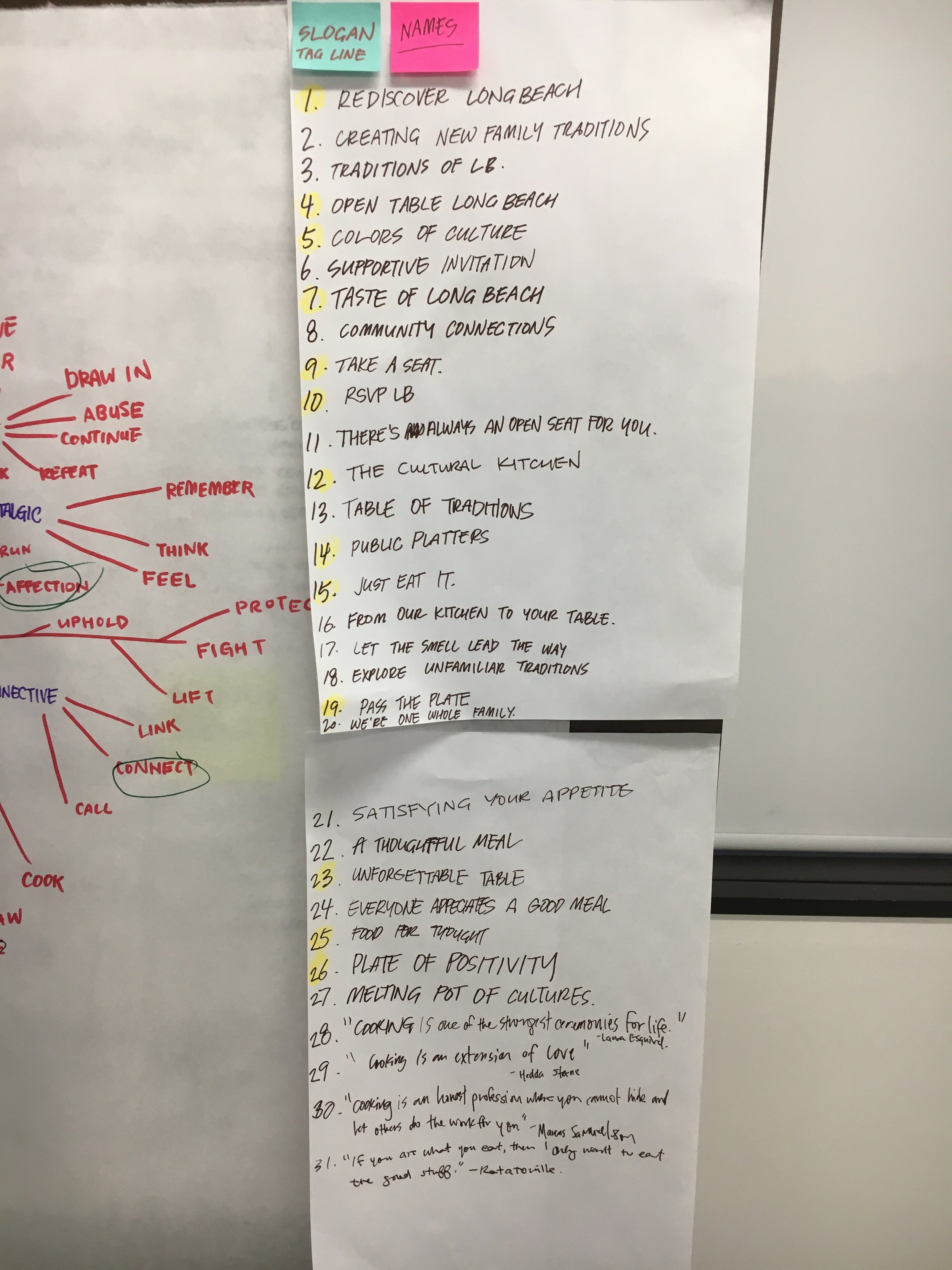
Messaging
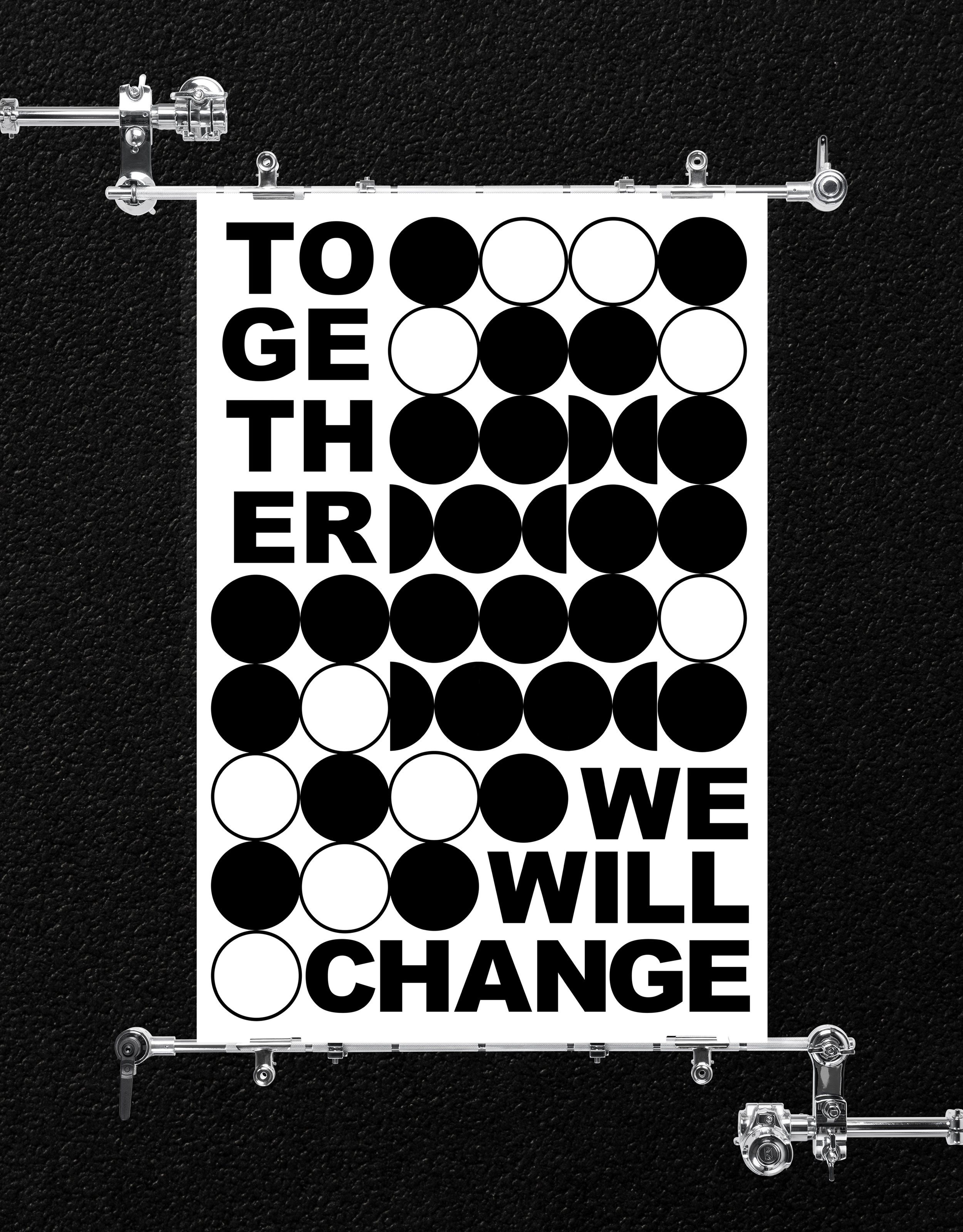
We are sending messages to the community and Long Beach Police Department.
Tone of Messaging:
Encouraging Positive Authentic Diverse Direct


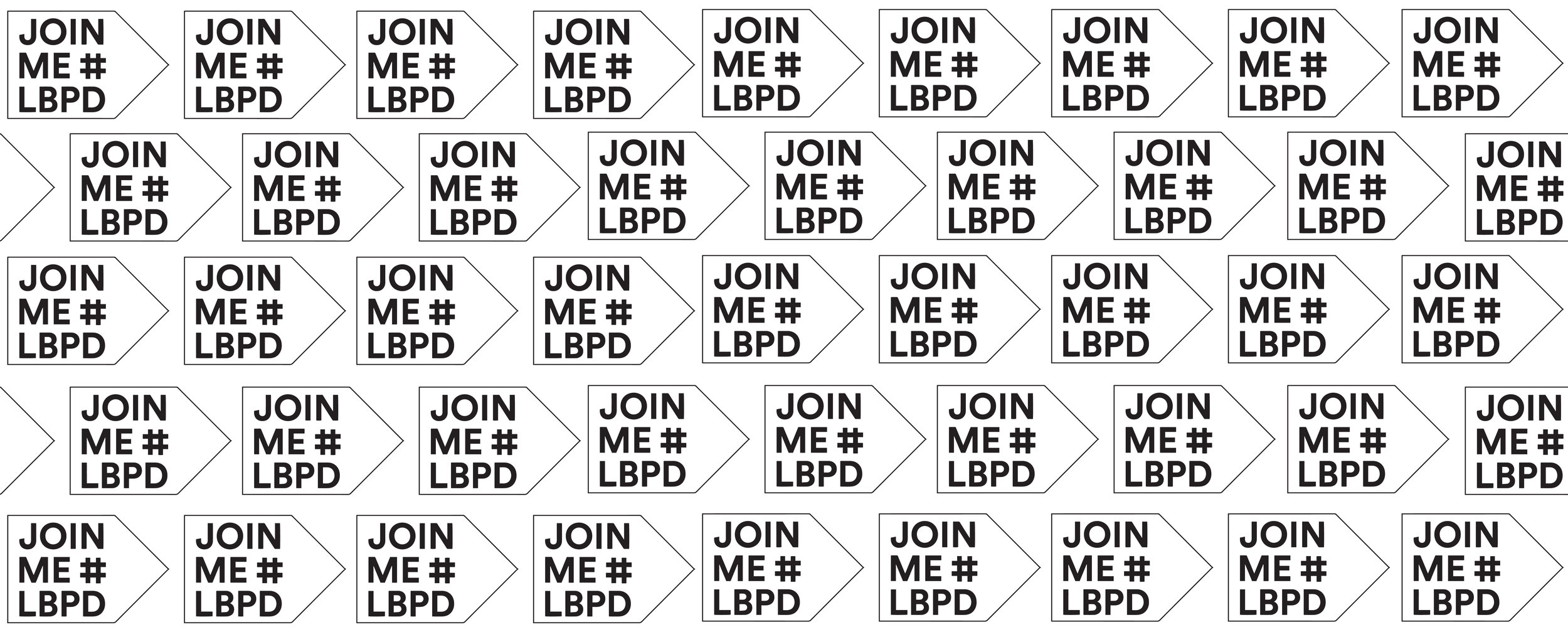
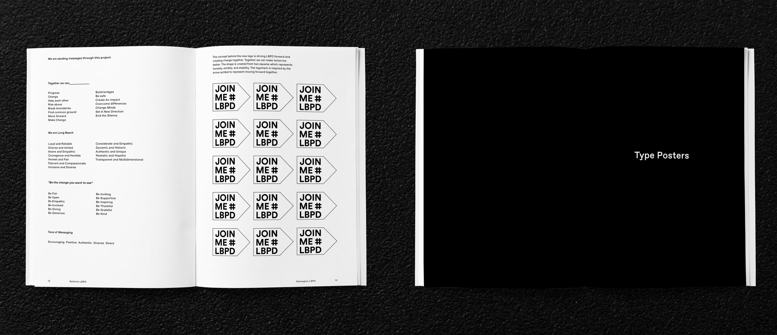
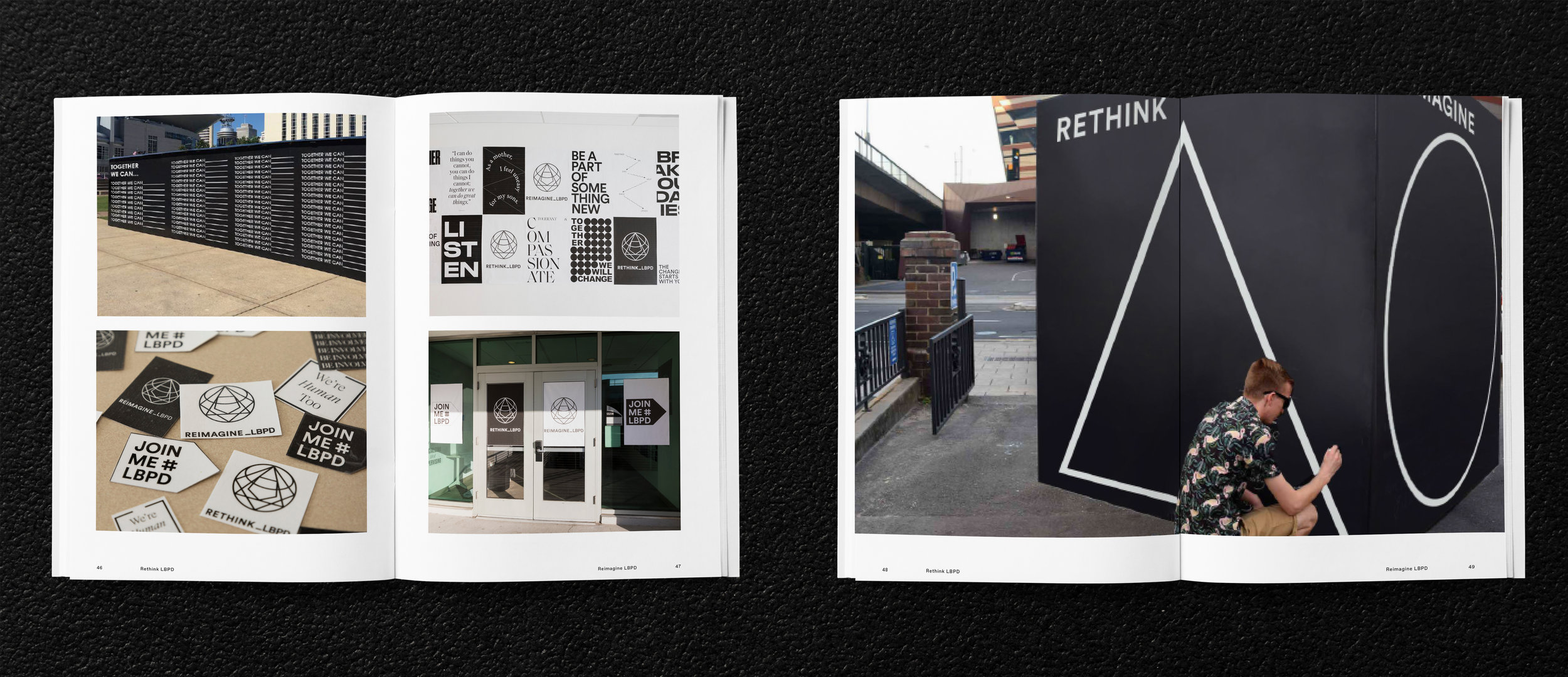
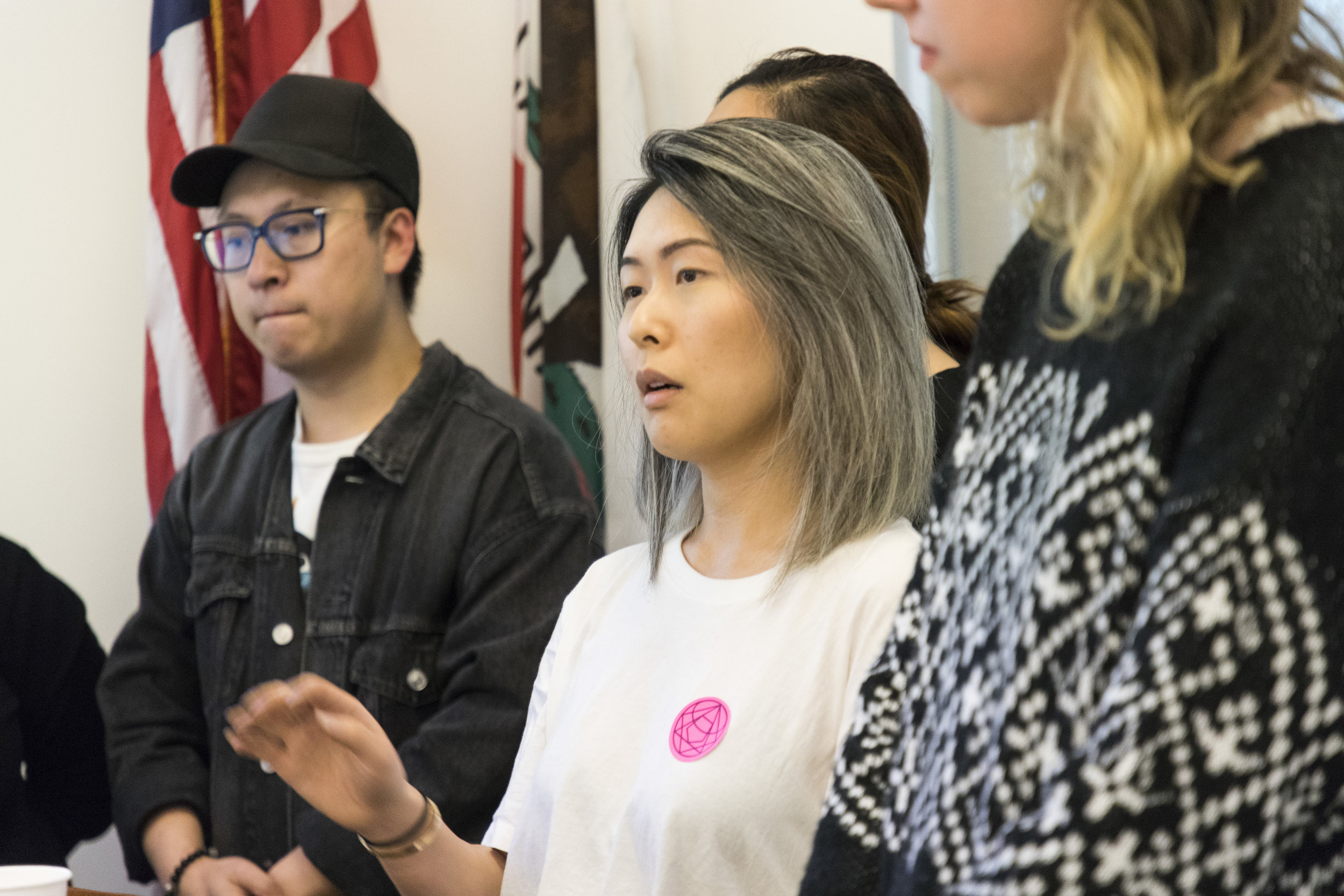
Join Me LBPD
The concept behind the Join_LBPD logo is driving LBPD forward and creating change together. Together we can make tomorrow better.
The shape is created from two squares which represent honesty, solidity, and stability. The logomark is inspired by the arrow
symbol to represent moving forward together.

Logo Motion

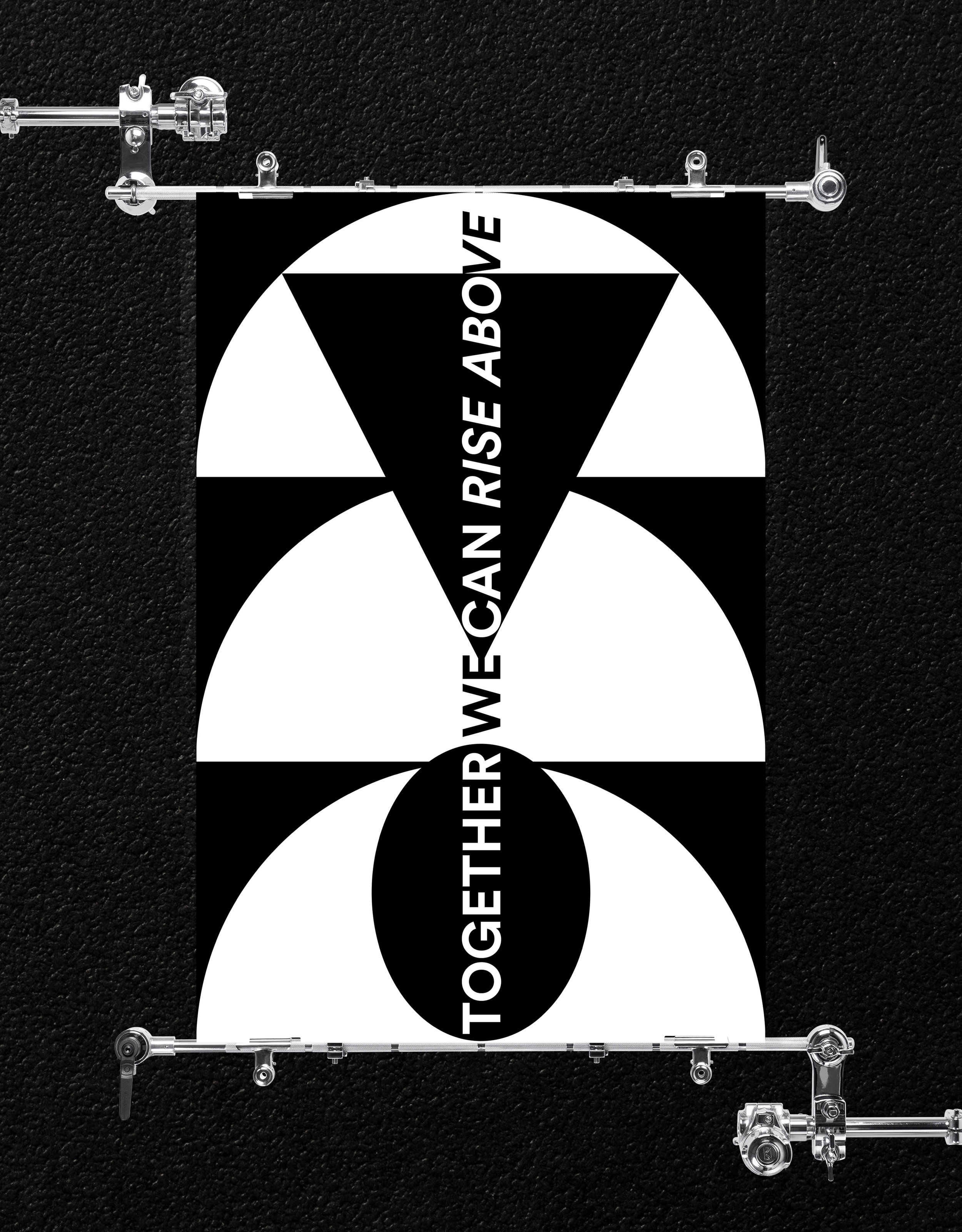
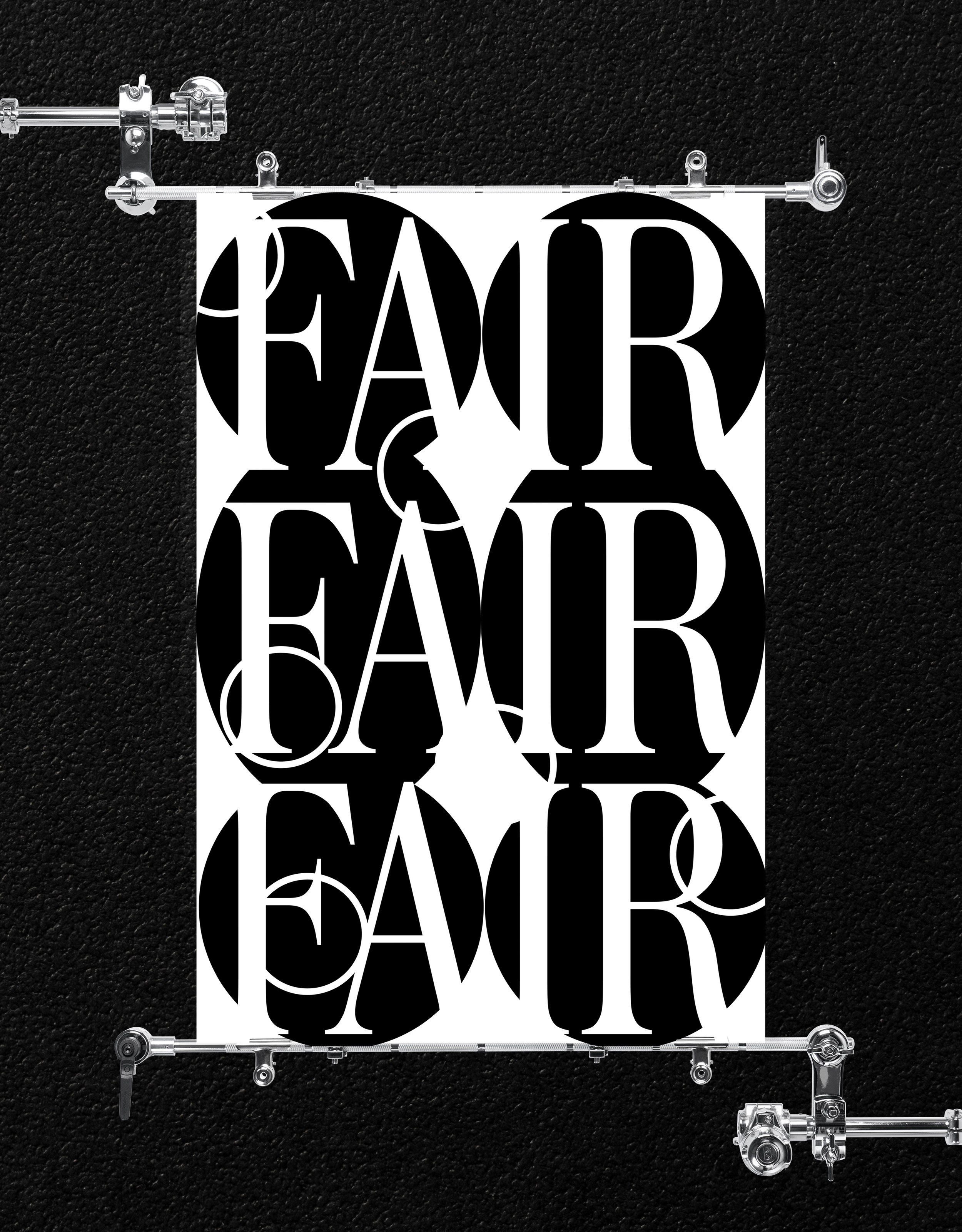
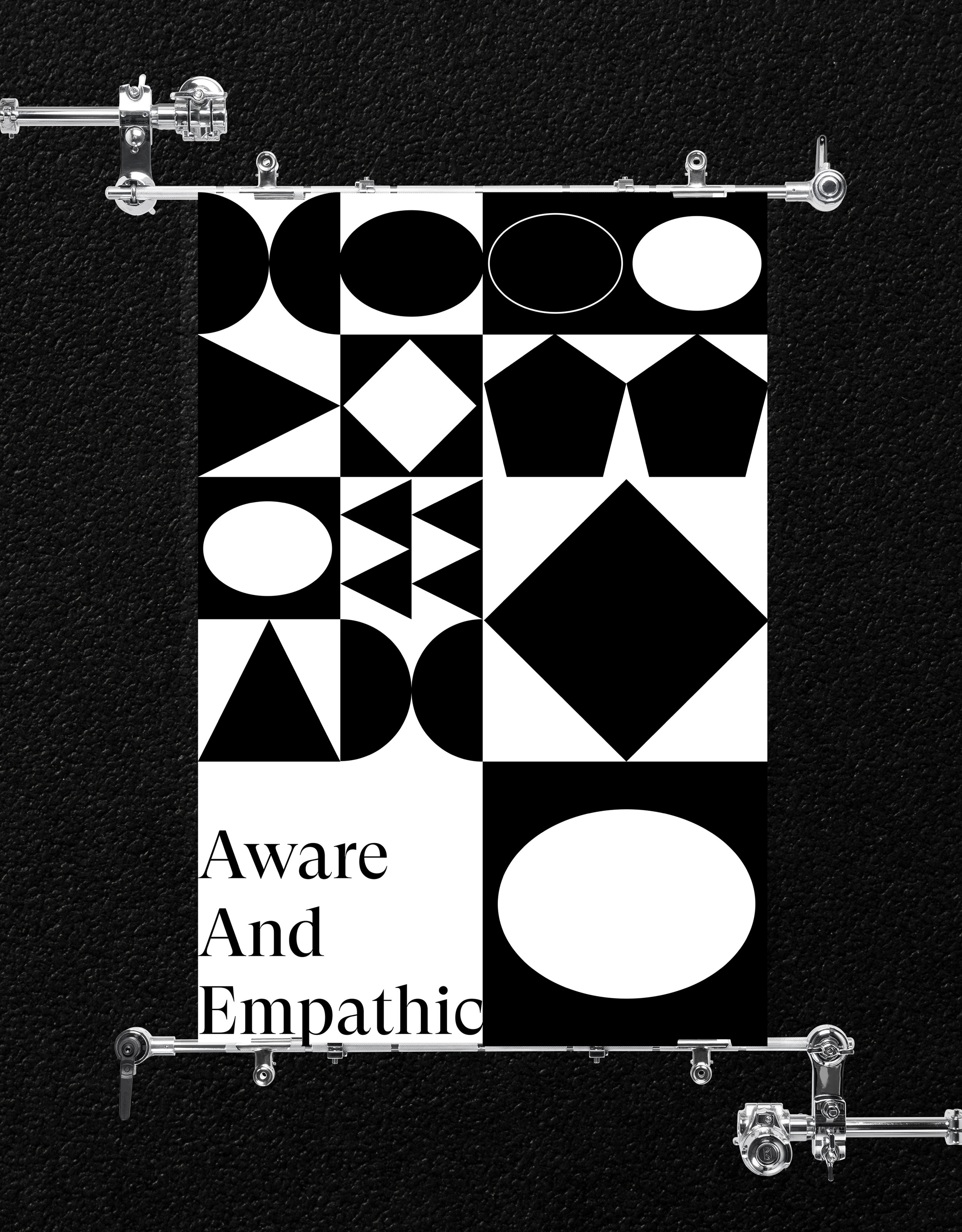
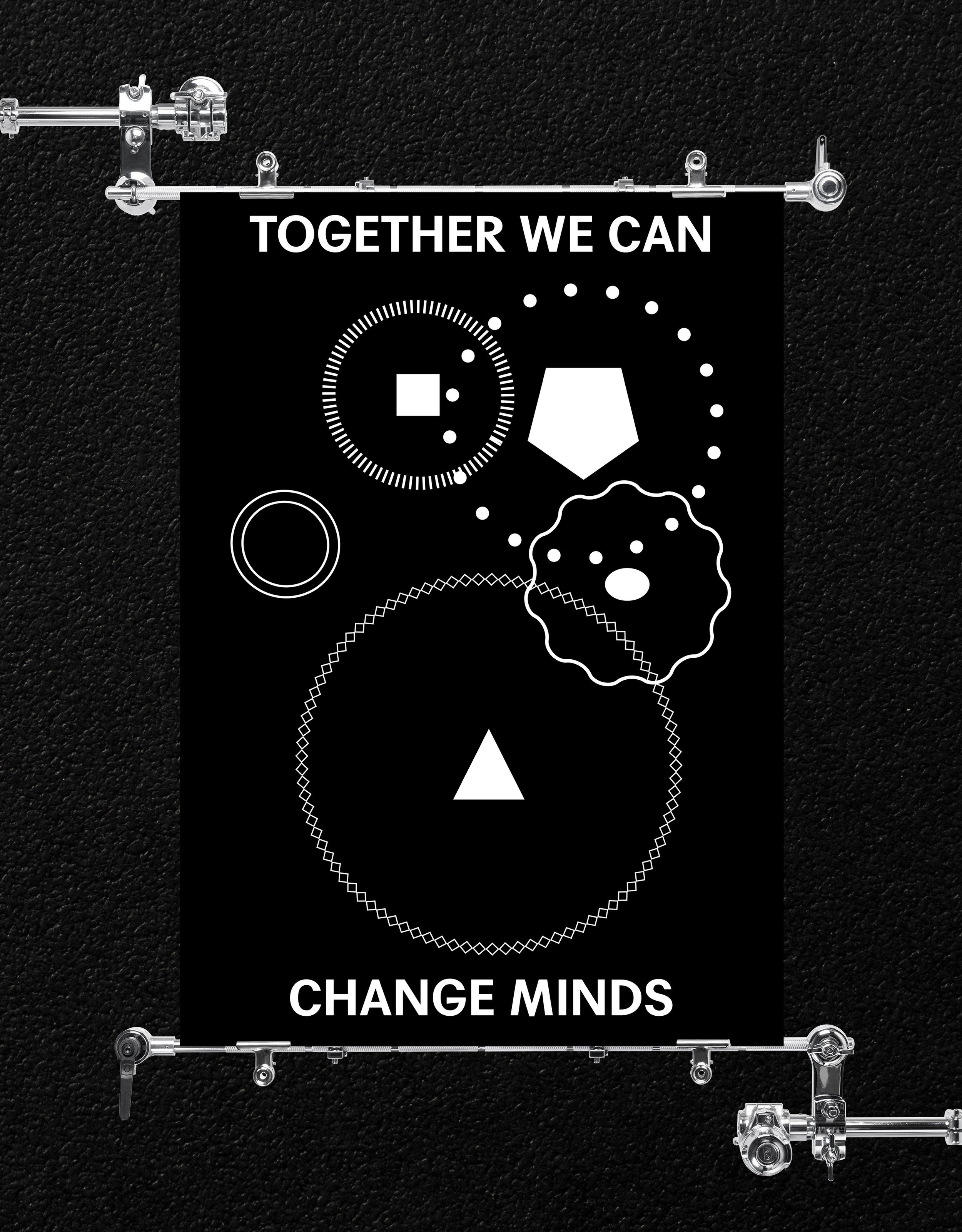
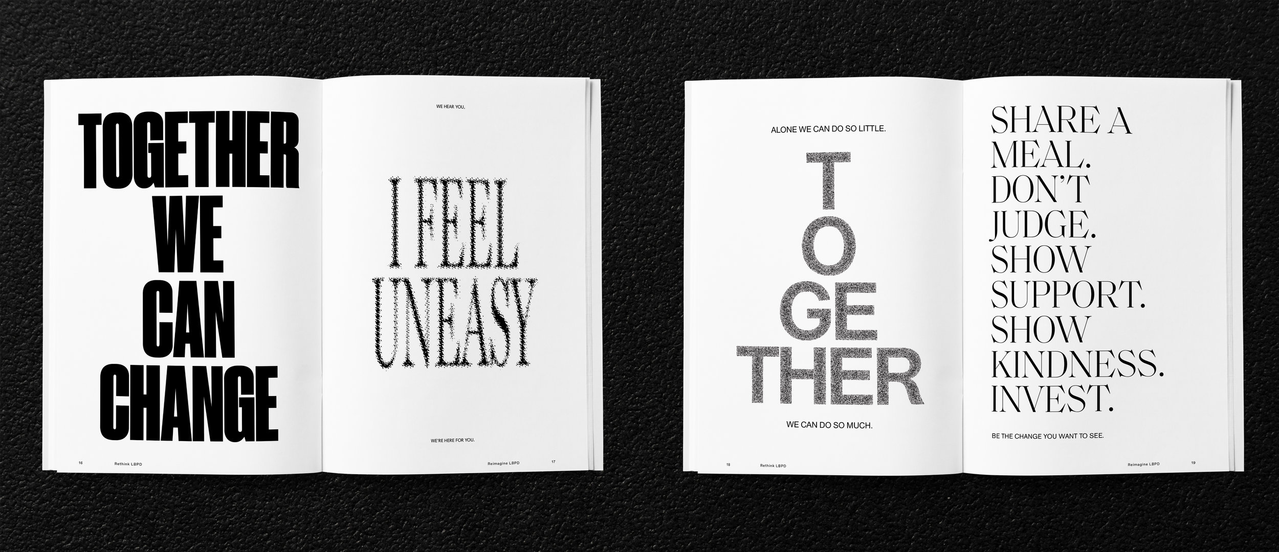
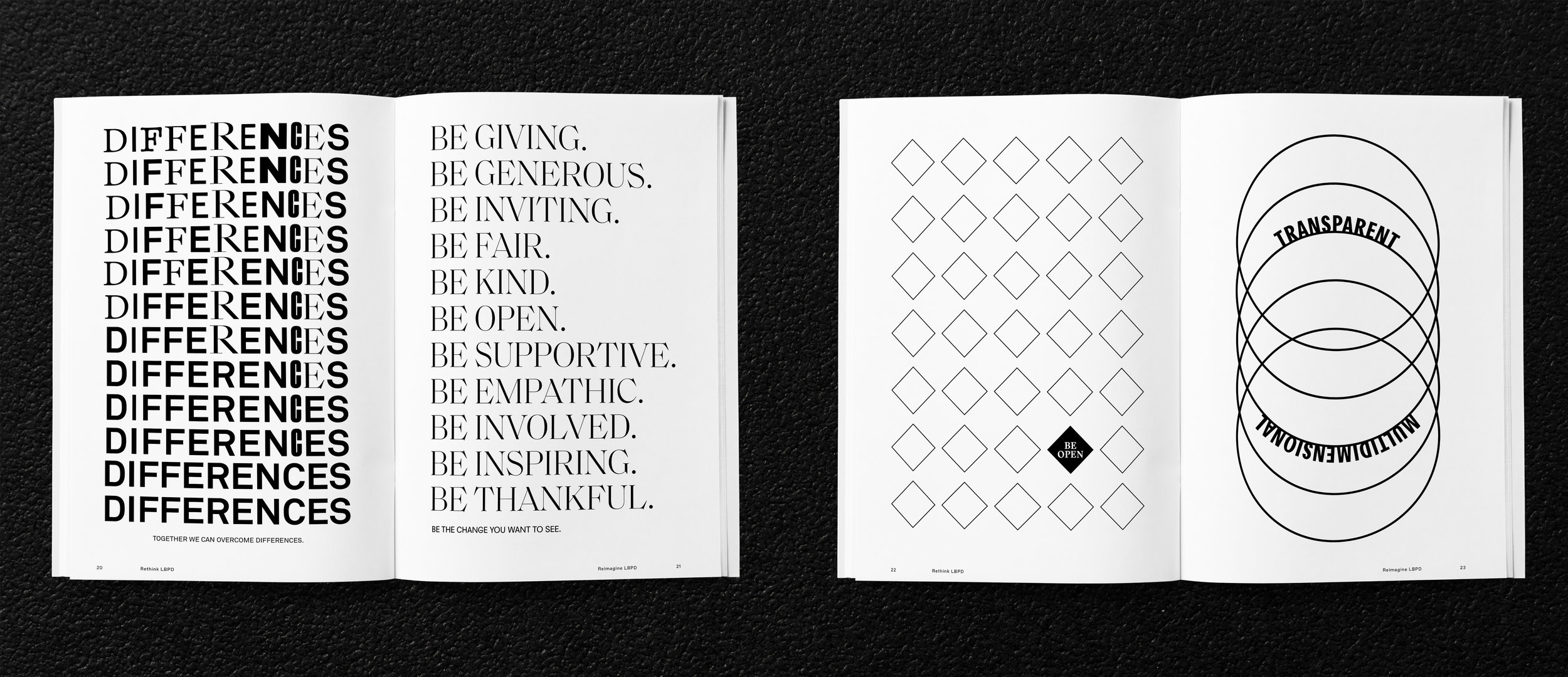
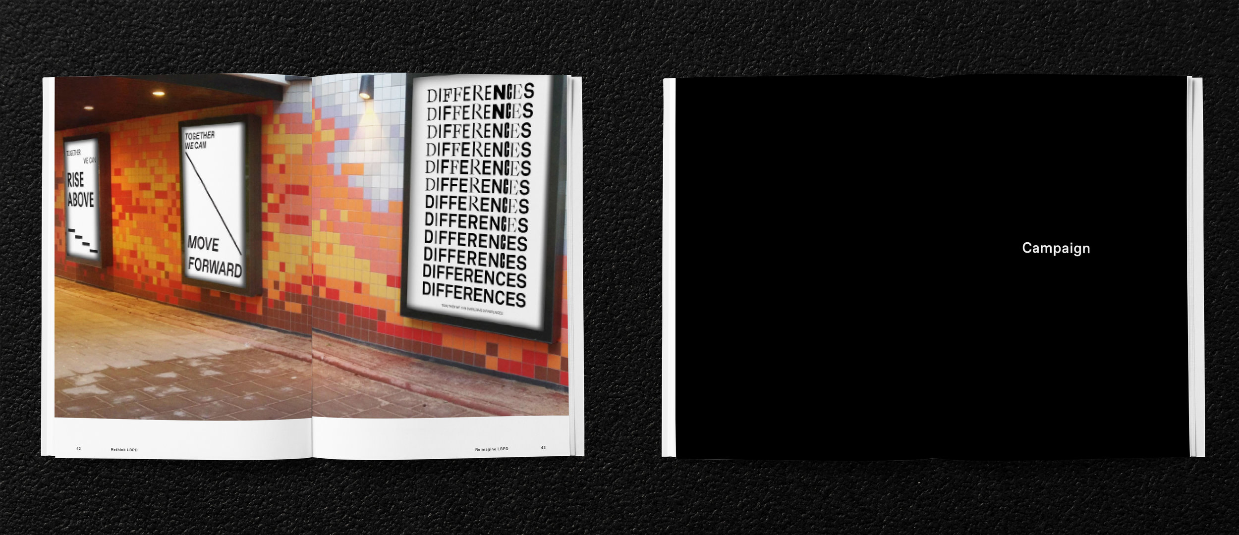
Type Posters
We are sending messages through the type posters.

Post Card
Applications


Catalog Book
Event Attractions


Research Development


Featured In
Granted by


